
Lyft Rating System Redesign
background
WHEN: January 2017
DURATION: 6 weeks
MY ROLE: user research, testing, low-fidelity prototyping
In mid-January, my Human-Centered Design and Development class was assigned our second project of the semester. My final deliverable was a low-fidelity prototype as my professor wanted us to hone in on our sketching skills.
skip to:
our goal
Our goal was to create a replacement for the current five-star rating system that Lyft uses to track and reward drivers in their system. We must consider the ways various rating systems constrain the input of users, the ease of use (e.g., speed of input in a busy urban environment), and the ways in which this information could be used maliciously against drivers.
our design process
primary research
We started off by interviewing random users of Lyft in order to understand how they interact with the application and in particular, the rating system. Here are some key takeaways from our interviews:
Most people trusted the rating system as a general indicator of the quality of the experience.
Many users did not know how the rating system worked, and they rated according to their individual understanding of what the five-star system represented.
Many people said that they usually rated 4 or 5 stars.
Nobody that we interviewed had ever rated a 3 stars or less.
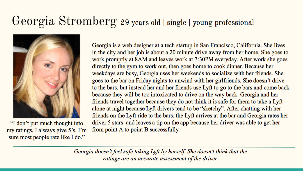
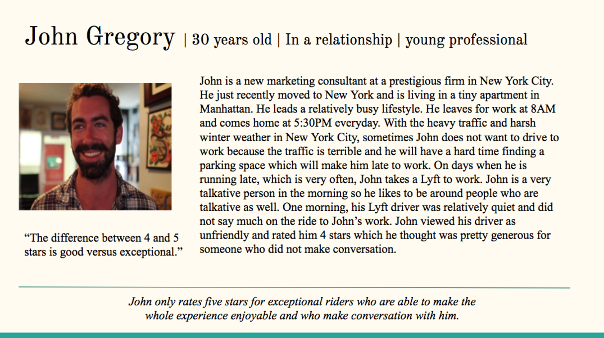
Using our affinity diagram, we formed our personas. Meet Georgia and John.
secondary research
We did secondary research to understand how Lyft uses the data from the ratings, and what drivers’ general perception of the rating system is. Here are some key takeaways:
We found that the overall attitude towards the rating system for drivers is negative.
Many drivers feel as if users do not understand how critical ratings are to the driver’s career and therefore rate harshly [1].
Upon further research into the statistics of ratings, we found that most ratings are either 4’s or 5’s. And that 5% of all ratings are 3’s and below [2].
We concluded from our primary and secondary research that the underlying problem with the rating system is that user’s do not have the correct mental model of the rating system. They do not have enough context with which to rate, and therefore they rate according to their own system.
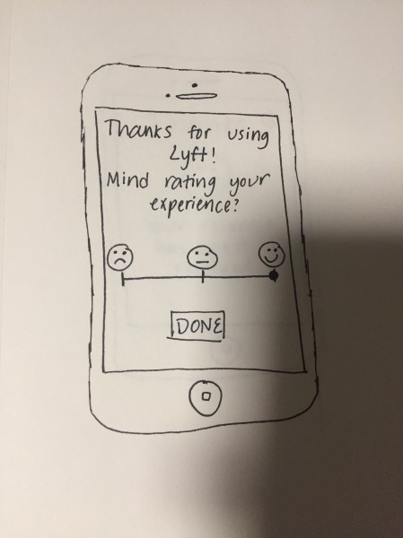
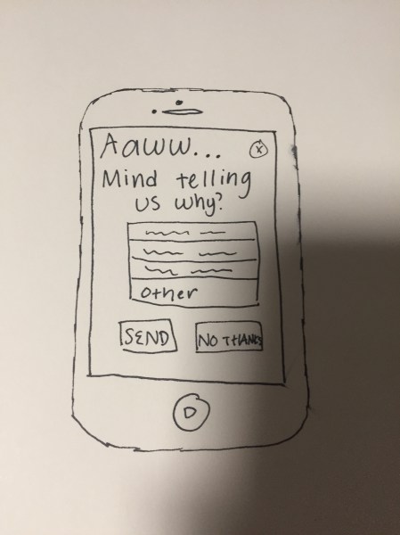
We decided to provide context behind each rating option. This way, users will know what each rating means, which will prevent them from rating on their own terms which is detrimental to the driver. In our original sketches, the context we gave was through emoji’s.
peer critique session
We had an in-class critique session where we told the class the direction we were headed in, and we presented all the work we had done so far.
Here are some key takeaways from the critique session:
We realized that emoji’s were not interpreted the same way universally, which could lead to confused users in foreign countries. Some further secondary research confirmed this idea [3].
We also realized that instead of only asking for feedback if the ride was anything less than perfect, we should ask for feedback for a perfect rating as well, so that the driver will know what they are doing well.
The last flaw was that we forgot to incorporate the current Lyft tipping system into our sketches.
To read about how we addressed this feedback, click here.
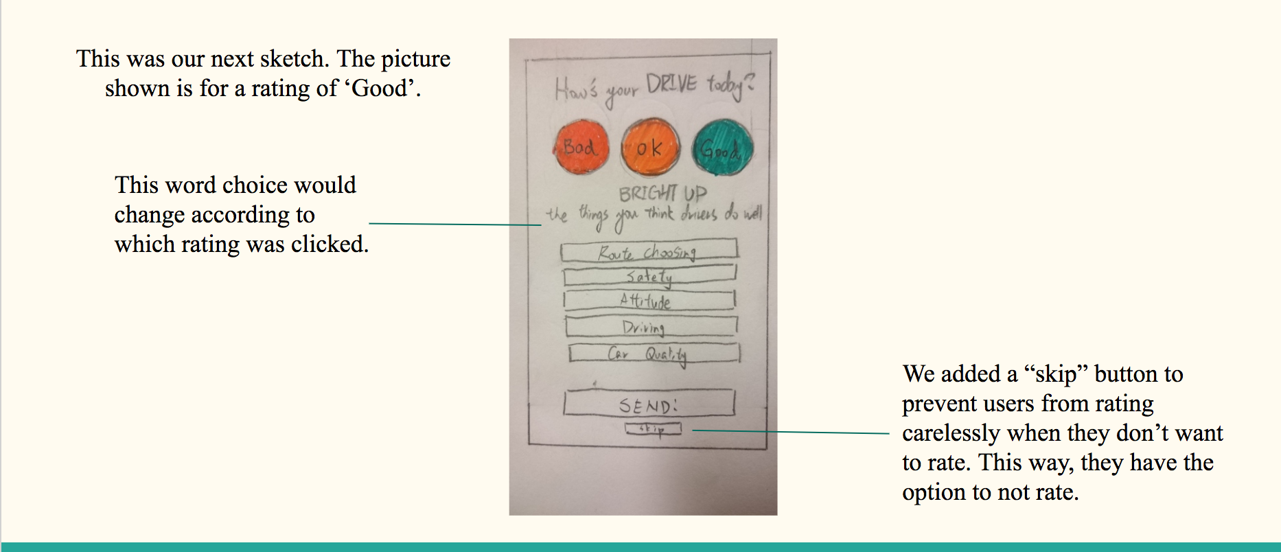
After much conversation within our team, we realized that there were many flaws with our sketch.
Here's what we noticed:
The first flaw is that it is too complicated to have the wording under the rating bar change according to what rating is chosen. Rating should be more uniform.
We also realized that if nothing was wrong with the ride, and it went as it should, the user shouldn’t need to do extra tapping to indicate what was good about it, because the ride went as expected. People who rate “good” should be given the option to compliment the driver, that’s all.
Next, we realized that Lyft currently does not have a “skip” option. Basically, if the user wants to do anything else on the app, they have to rate first. We didn't see why we shouldn't incorporate that into our design as well, so we did.
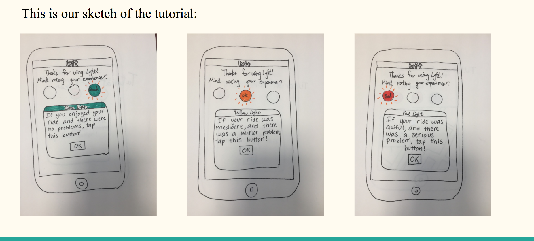
Lastly, to reinforce what each rating means, we decided to provide an in-app tutorial that would be shown to the user the first time they use the application.
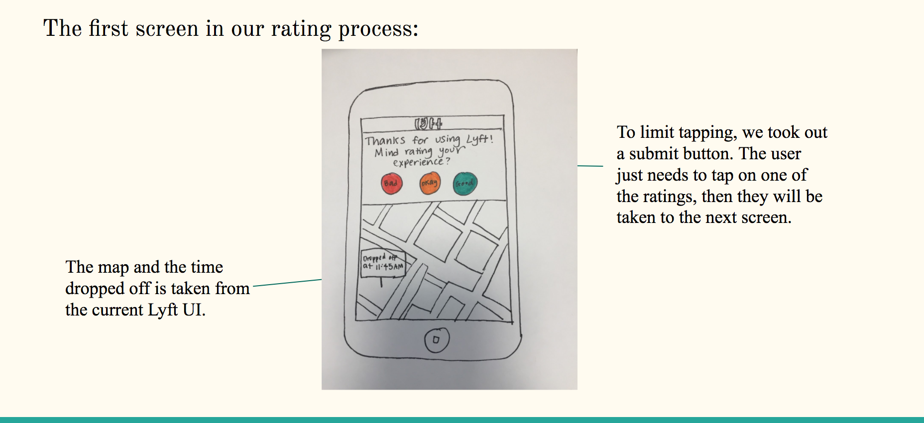
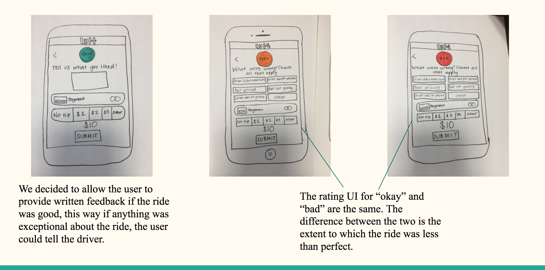
Sketches
usability testing
You can find our usability testing protocol here.
problems highlighted after usability testing
Two out of the four users tested were confused about the tipping and pricing portion of our prototype, which is the design taken from the current Lyft rating system. We realized that this could be due to the fact that our prototype was not interactive enough. Using the advice of Carolyn Snyder from Paper Prototyping, we decided to make some changes to our prototypes for further usability testing. We decided to interactively change the price of the ride based on what the user chose the tip as. This made it more clear that the price shown was for the entire ride, not just the tip.
One of our users interpreted the “Choose all that apply” section of our rating differently than we wanted them to. When rating for scenario 3, the user clicked on “Driver had a poor attitude” as well as “Other” even though “Other” should only be clicked if none of the user’s feedback is shown. In other words, “Other” should be clicked by itself. To fix this, we added some color to the buttons to make them more distinct.
Final Paper Prototype
*Note: Given that this was only my class' second UX project, my professor wanted to emphasize the importance of creating paper prototypes and thus did not allow us to create digital prototypes.

Critique + Takeaway
After, 4 weeks of working on the project, we gave a final presentation to our class. The class was able to give us live critique via Slack, and in-person critique after the presentation.
Here are some key pieces of critique we heard from our class:
Our presentation seemed slightly unorganized, and we seemed a bit unprepared for presenting the prototypes to the class.
We shouldn't have started our presentation by bashing the current Lyft rating system— that wouldn't sound good to a stakeholder.
reflection
In this reflection, I'm gonna allow myself to be a bit vulnerable by revealing the mistakes I made as a team member on this project. This is difficult to do, but life is about learning from your mistakes and picking yourself up after you fall. It's better to fail early so I can succeed earlier.
Although it's not evident in the rest of project, my teammates struggled to work effectively as a team due to the fact that we all had differing opinions of what our design should be, and why we should do it.
Our disagreements caused our presentation to be inconsistent, and my classmates were able to see that in our presentation, despite how much I thought we could pull it together to make it seem as if we were all on the same page. I learned that in order to be an effective team member, I need to be less stubborn. I need to be able to listen to a good idea even if it differs from my own.